The decision has been made to set-up an online shop or, perhaps, you have decided it is time your current website could do with a re-design. However, that sickly feeling returns to the pit of your stomach, sweat begins to bead upon your brow, and you are left with the horrible thought “Where do I even begin?”. Understandably, creating a site design can be a daunting task and designing specifically for an ecommerce website has its own set of issues. Of course, there is always the option to employ the skills and expertise of a web designer and let them deal with the stress while you happily sit back and enjoy the ride (although your experience can vary from designer to designer). However, if you are on a strict budget, and are unable to afford one, you may need to tackle the job yourself. It's likely you already have an idea of the 'end product', however, the design must always reflect the products you sell and the type of visitors you want to attract. For example, a cupcake shop should use an elegant design with soft colours and clean images. 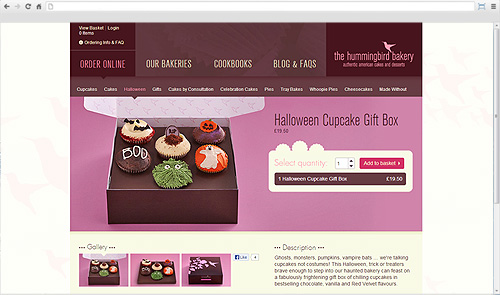 Whereas a technology brand's website should be innovative and uncluttered with large, high quality, and tempting images. 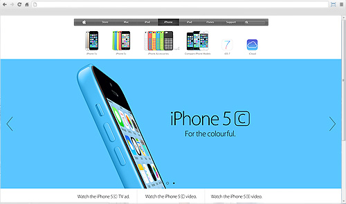 The design should always reflect the ethos of the business whilst remaining professional and easy to use. Having an overly cluttered, hectic website with too many colours, excessive amounts of text and lots of busy images can immediately put potential customers off the idea of ordering. Understanding any research you may have done into your products, target market, and competitors will help you to achieve the right look and feel for your site. The key elements to consider even before you start are:
We will focus on Colour and Logo Design in this post but look out for future posts on the remaining ones. The importance of colourColour, or Colour Theory, can play a huge role in the branding and design of a website because of the way people view different colours, and combinations of colours, can have quite an impact on your conversions. There are lots of resources available that explain colour theory, and its uses, in far more detail than we could ever cover here but a good place to start is - An Introduction to Color Theory for Web Designers on Webdesigntuts+. When planning your design think about what colours are associated with your brand. Does your logo have colour in it? Do you have a bricks and mortar shop that features certain colours within it? Think about how many famous brands you recognise just by the colours associated with them. Do you know which famous food and drink brands these colours belong to? Hint: click on each colour to reveal the site
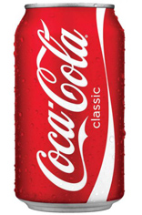
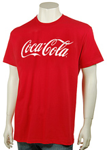
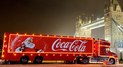
Once you've decided on your main colour, you will need to choose any other colours you may want use in places where you need to highlight areas such as call to action buttons, menus, upsell areas and, most importantly, the price, discount message and availability. If the choice isn't an obvious one then you can use one of the many online tools to help create a small set of complimentary colours for your website. Adobe Kuler 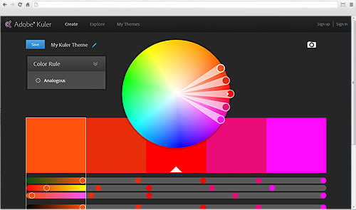 ColourCode 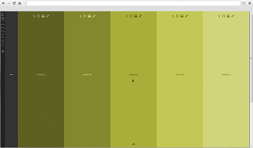 Color Scheme Designer 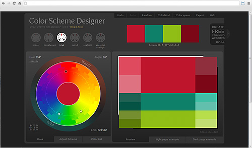 Whilst making your decision, always remember that certain colours can evoke certain emotions. For instance, pink is seen as being feminine and delicate, whereas green is seen as being associated with nature and money. But, be aware that what one person associates with a colour might not be the same as someone else. What does red mean to you? For some it could be urgency and energy but for others it could mean danger and stop. Use your knowledge and research of your target market to determine how your colours will be perceived. Branding your logoDesigning a logo can be a daunting task because it will be the first thing people will associate with your company. Customers should be able to gauge the nature of your business just by looking at your logo. If you sell luxury products, then it is generally expected that your branding will reflect this, so a bright and playful logo may give the customer the wrong impression of your website and its products. Whether you plan to design the logo yourself, or pass over the responsibility to a designer, you will always need a brief. Setting limits for a design will give you an idea of what to expect when the final version is completed. Think about the font, should it be classic and authoratative, should it be more stylized and whimsical or would it be better using one that looks like actual hand writing? Should you include an icon? If so, it must be something that immediately tells people exactly what you are about. Have a look at the well known brand logos below, even if you didn't know these companies you could probably guess what they did just by the icon and font style. When creating your logo you should always choose an appropriate graphics program; MS paint and Clip Art will not give you a professional end result. There are plenty of free graphic programs out there (such as GIMP), so there is no excuse. However, should you choose to pay for a solution, Adobe Photoshop remains one of the most popular. Your completed logo should be scalable for all media types such as on social networking sites, on a business card, blown up on a billboard, applied as a graphic to a car or even embroidered onto a shirt. Think about all the different places the famous Coca Cola logo appears and how it has to be scaled for each one. Always make sure this is considered before signing it off because you don't want to be stuck with a tiny design that you can't use in places where a larger one is needed.
Now, with your colours decided and your logo designed, you should begin to get a real sense of what your site will look like. To find out how to implement them on your website see our blog posts How to: Insert a logo into your Bluepark website and How to: Customise the colours on your Bluepark website. The next post in this series will cover typography, images and layout to help you understand how to go about filling the website with all your content. Try Bluepark for FREE for 14 daysFull access to everything including our support team, no card details required |
|

|