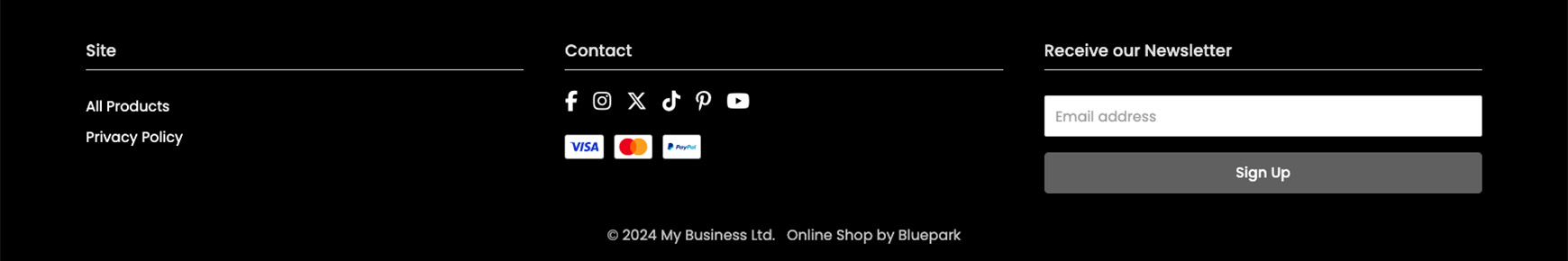
The basic Footer of any website contains links to particular pages on that site, such as Delivery information, Terms & Conditions, and more. The Footer has been commonplace for many years across the web, so visitors instinctively know where to find the previously aforementioned information. Therefore, it is highly recommended that the Footer on your online shop includes these links to ensure the best experience for your customers. Please note, the new Footer Links only work with V2 themes. If you are still using a V1 theme on your site, you will need to upgrade to a V2 theme in order to use these. We recommend watching our Introducing Bluepark V2 Themes video and having a read of our Introducing Bluepark V2 Themes guide before you start. Contents What should I put in my site's Footer?As mentioned above, visitors expect to find links to certain pages within your Footer, so it's very important to include them here. These are:
Other links you could also include are:
Have a look at the Pages you've created on your website and see which ones you can add to the Footer to ensure visitors can easily access them. Perhaps you've got some information pages that visitors often struggle to find and constantly contact you about. If so, make sure they're added too. Alongside links, you may want to include standard text (with no link) to provide visitors with your physical address or a short summary about your business. You may also want to add an email newsletter sign up form, social media icons, and icons for the different payment methods you take. How your Theme affects your FooterEach of our Themes has the Footer set up in a specific way. Therefore, it is important to check the Recommended Footer Columns within your chosen theme to add the right content to the right columns. This will then ensure the content is displayed in the correct place.
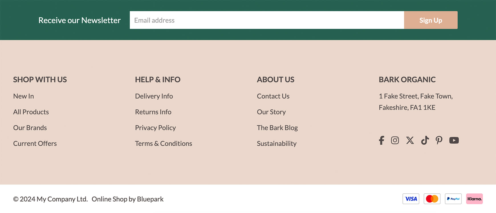
An example of this can be seen on the Bark Theme. For Bark, it is recommended that the Email Newsletter Form is added to Column 4 - this will ensure it is displayed within the green bar above the Footer Links. If you add anything other than this form into Column 4, this will be displayed in the green bar, instead. The Recommended Footer Columns for each theme can be found by clicking into your chosen theme in the Themes section on our website and going to the Documentation tab. Alternatively, you can by click the View Documentation link under each theme in the Theme Library in your admin panel. Create a new footer elementThe Footer will be generated from the information on the Footer Links section in the admin panel. Follow these steps to create a new footer element:
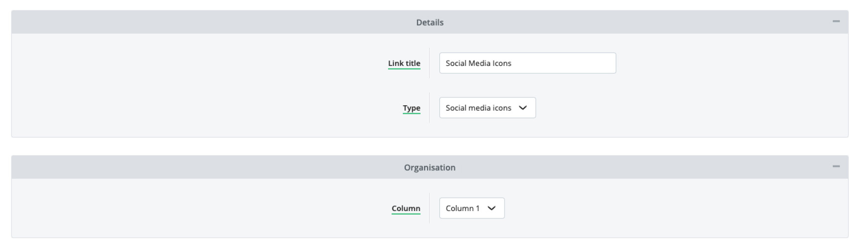
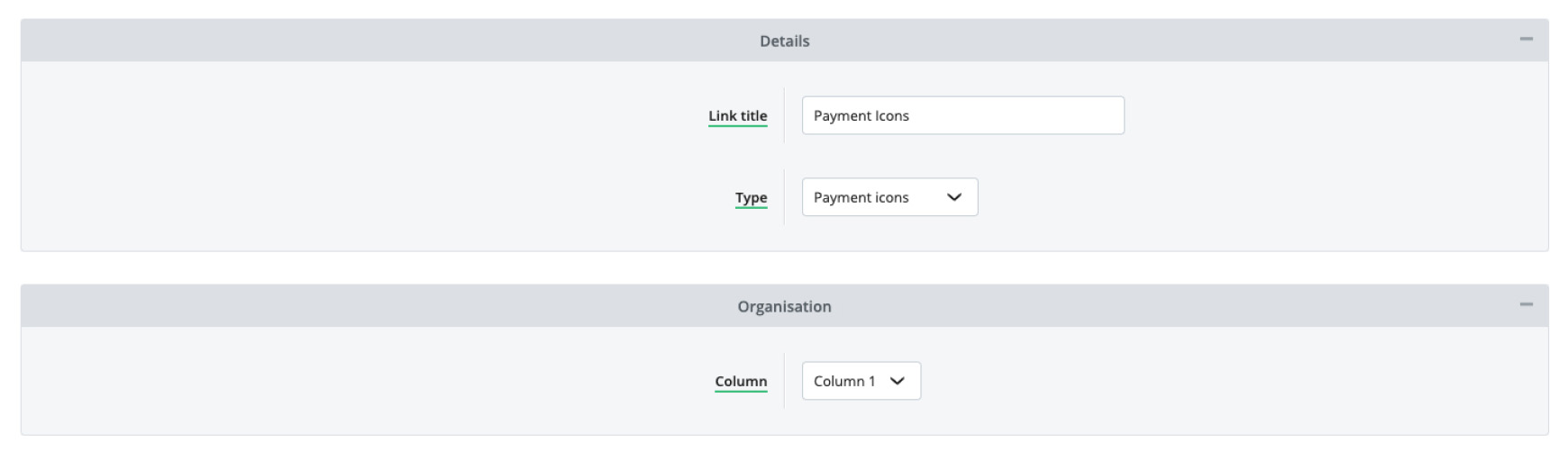
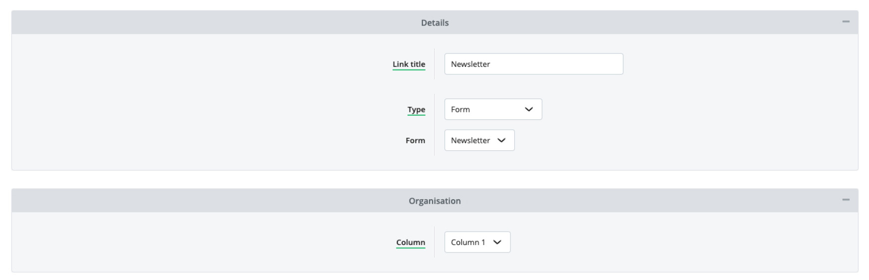
As you create your links and elements, you will see them listed within the Footer Links section in the admin panel. They will be listed within their respective chosen Columns to make finding each one easy. From here, you can also see the link Path, Type and Column it's assigned to. Elements can be moved within their Column section by dragging the green up and down arrows. If the element needs to move to a different column, then click Edit Footer link TypesThere are 5 element types you can choose from within the Footer. These are: Link, Heading, Social Media Icons, Payment Icons and Form. Below, we go through each of the types and what they would be typically used for. Link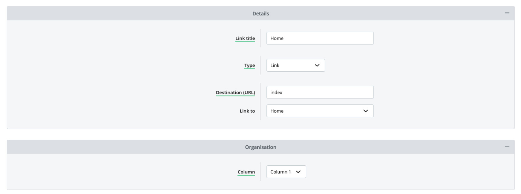 Selected by default, Link is the most common element used. This Type can be used for standard text (with no link) or for standard links.
Heading
Exactly named, a Heading will be a heading that typically is placed at the top of a column or to create sections in the same column. The theme will apply the styling of these headings automatically but can be modified with Additional CSS. Social media icons
If your shop has a social media presence, and you would like to display these links on the website, assign this type. The relevant Social Media icons will then automatically be displayed when you add the URLs to your social media profiles within the Social Media Links section in Integrations. If no links have been entered, then all icons will display but won't have any links. Payment icons
To display payment card icons that are accepted on the site, assign this type. The card types that have been ticked to be accepted on the Payment Options page in Integrations will automatically show when using this footer element. Please note, most of our themes have these within the Footer already and there will be no need to create them within Footer Links. Form
A Form can be used to gather information such as email addresses for newsletter sign-ups or any other information. The platform will show the list of forms created in Forms to for you to choose from. Example Footer creationIn the video below, we recreate the default Footer elements from scratch, so you can see how easy it is to add new elements. Any new trial will have these links already established within your Footer Links page. You can edit and move these to suit your needs to entirely replace them with your own. Advanced users: custom HTMLIt is highly recommended that you use the Footer Links section to generate the footer content for your site and allow the theme's code to style these to match the rest of the theme. This will ensure your Footer is completely responsive for all devices. Please note, it is important that you don't ever copy the content from the Footer Content field from a V1 theme into a V2 theme. This is because the V1 content is coded completely differently and will not adjust for different devices. For advanced users, who are confident with HTML and CSS, you can create your own Footer and style it however you wish. To do this, go to the Footer Tab within the Theme Editor and edit the Footer HTML field. Depending on the theme, you will find code within this field already, including the variables for the Footer Columns, each individual Column, Social Media Icons and Payment Icons. Details of these can be found within the Variables for Footer HTML section, underneath the Footer HTML field.  How to change the content on your theme Follow our step-by-step guide to add a basic product, including its title, description, images and videos, price, stock level and more.  If you have lots of categories, you'll want to implement a mega menu to ensure visitors get to products they want quickly. Try Bluepark for FREE for 14 daysFull access to everything including our support team, no card details required |
|

 to start the creation process of a new footer element. Alternatively, if you already have columns set up, clicking the Create New
  icon at the top right of that column section to add a new element to that column.
 . Information about these Types are detailed below in the
  on that element and change Column to the required column.
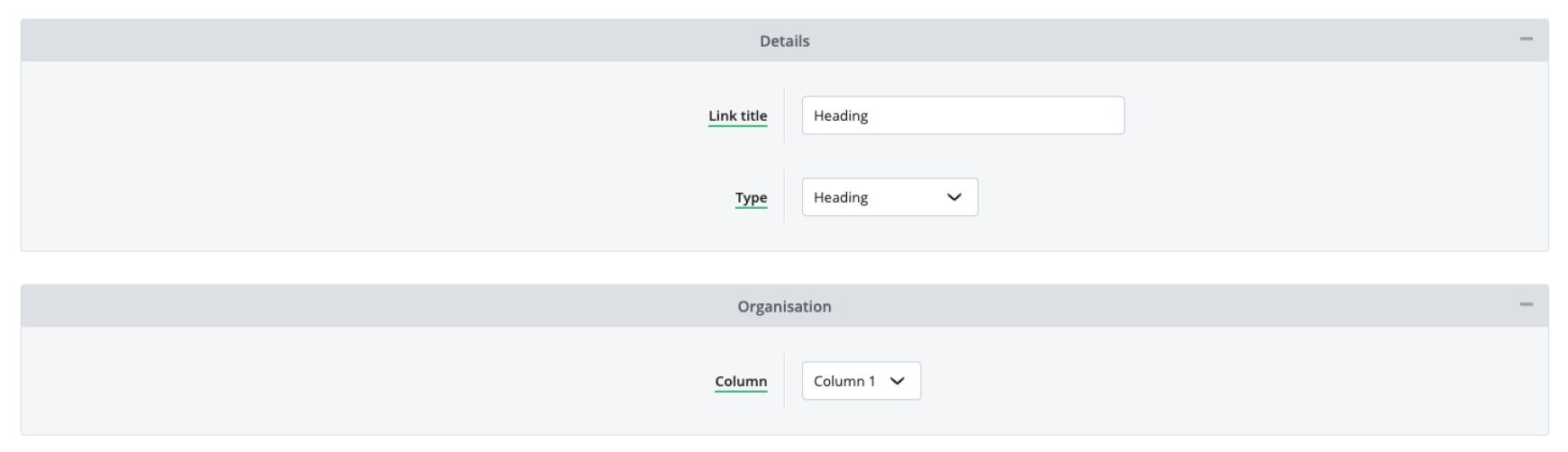
|