There are two ways a customer will initially look for products on a website - firstly, through the search function and secondly, through the category structure. The way a customer will navigate your site will depend entirely on what they are looking for and why they are looking for it. If they know exactly what they want it is likely they will use the search function. If they want to look for a gift for someone and need to be inspired they are more likely to browse through your categories. Allow customers to searchDon’t be tempted to skip on the site search function. It’s not only a helpful way for your customers to look for products but it’s also a great tool to learn what your customers expect to find on your site. If one of the most searched phrases is a product that you don’t stock see if you can add it to your catalogue. It’s all about supply and demand!
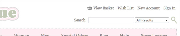
Your search function fields need to be above the fold, i.e. in the top part of your website where the viewer doesn’t have to scroll down the page. The best area is somewhere within the header section so that it doesn’t interfere with the main content and won’t make the site look cluttered. Whether you centre it or have it aligned to one side will be a bit of trial and error. Amazon has done a lot of testing on the location and design of their site search fields and has found that centring it at the bottom of their header section has proved the most successful. They also utilise the Search in Category function to allow their customers to drill down quicker to the product they are searching for. You can add this into your Bluepark site by selecting 'Yes, search and category' from the Enable search bar option in your theme.
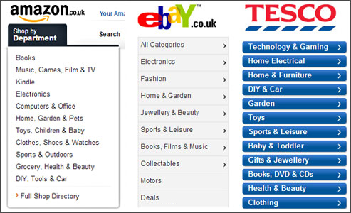
Creating your navigation structureTry to work out a structure hierarchy to your categories early on. This will save you making big changes later on that could end up confusing your customers and creating dead links for SEO. If you already have a physical store, don’t assume your customers will browse in the same way online. Start with the top-level or global menu which is the menu that will be visible throughout your site. Best practice is to have no more than 10 static top-level categories. You can always add in another rolling top-level category for events or special promotions. Take a look at Amazon’s global menu; if they can condense their millions of products into 11 top-level categories (minus their service options) then there is no excuse.
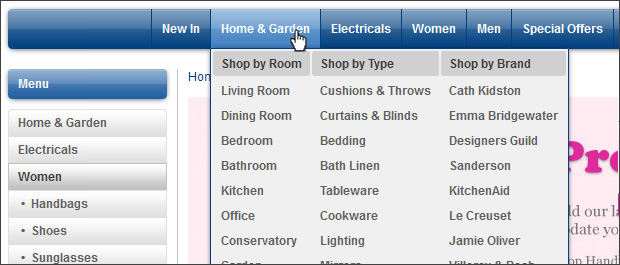
If you have a small collection of products then it is best to separate them into a small number of static top-level categories. Best practice is to never have less than 10 products in a category. If you have a large selection of products then use sub-categories to break them down further. For instance, Kitchenware could have sub-categories of Mugs, Glassware & Table Linen. Why not add a couple of intriguing categories into your navigation such as ‘New in’ or ‘Special Offers’? Customers love to see something they haven’t seen on your site before or what bargains they can buy! Giving your customers a choiceDifferent customers will browse your categories in different ways. Some may instinctively go to the left hand catalogue menu and some may go to the top navigation bar. Make sure you don’t alienate a selection of customers by only putting in one or the other. A popular way to do this is to just have the top navigation menu on your home page but add in the left hand menu on category and product pages. Your top navigation bar can offer the customer more than just the category structure. Why not add in a link to the Contact Us page or a store locator? You can also take advantage of our ‘Mega-Menu’ functionality to give your customers different ways of looking for products. In the example below customers can browse Home & Garden products by room type, product type or by brand.
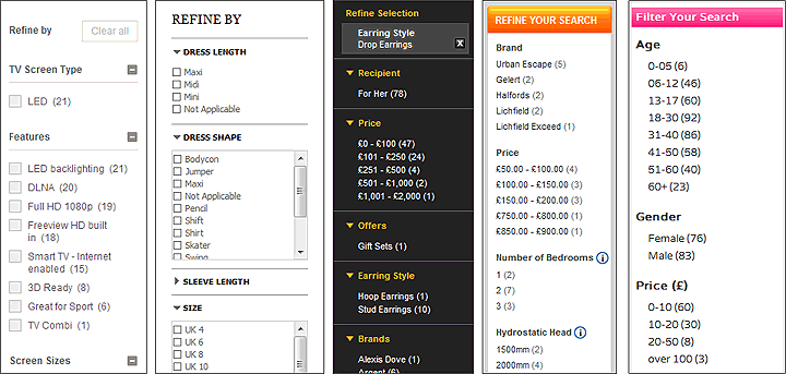
Narrowing down the resultsYou may have seen the filtering functionality on sites such as Asos.com and Johnlewis.com. This is where a customer can refine the products that are displayed in a category by ticking boxes next to certain criteria. This could be colour, length, size, brand and price for products such as dresses or screen type, features, screen size, brand and price for televisions. Providing effective refining options for your products can make a big difference to the customer experience. It allows the customer to reach the products they want to purchase much quicker by narrowing the results down to those with the features they are interested in. Make your filters relevant to both your products and your customers. Take the time to find out what your customers feel are the important features of your products. If you sell laptops, it is likely the price and the brand are more important than the colour, so, make sure these are the first two options that appear within the Refine block. If you have a lot of refining options, set the most important ones to automatically expand in the Refine block and the rest to be automatically minimised so the block doesn't stretch too far down the page.
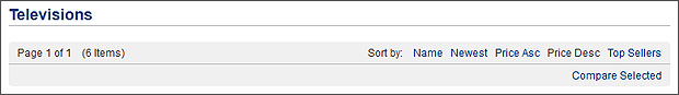
Other tips and tricksSort OptionsYou can set your products to display in a certain order in each category. This could be A-Z, release date, price ascending/descending, top sellers, quantity descending or a custom order. However, it is also best to give your customers the option to change the order themselves with a Sort bar that sits above and below the list of products. They might be searching for a gift on a budget and want to view the products in price order or they may be a regular to your site and want to see the newest products.
Compare ProductsDo you sell similar types of products? Perhaps your site offers laptops or beauty products with particular features. If so, give you customer the chance to compare the products they are looking at. This could help to seal the deal if a customer is looking for a particular component or function. Test, test and test againDon’t make alterations to your site just for the sake of it. Any changes you implement should be based on analytical data. You can find plenty of statistical information both within the sales and site statistics sections in the admin console of your website. There are even more within Google Analytics, so make sure you activate this on your site. Use the Visitors Flow to improve your understanding of how customers navigate through your site. The In-Page Analytics feature allows you to see the performance of particular links which can help when adding in a new navigation option. It is advisable to test any big changes on a select few before you release it to all of your customers. A great way to do this is by contacting a small group of your most enthusiastic customers or ‘brand champions’ and asking them to test it for you. All you need to do is make a copy of your current theme, implement your changes, then click on the Preview icon and view your site with your new theme. Make a note of the full URL of your previewed site so your brand champions can view it with your changes. You could offer them a free gift or extra loyalty points as an incentive but always have a set of structured questions to ask each one of them to make sure you gather useful feedback. Try Bluepark for FREE for 14 daysFull access to everything including our support team, no card details required |
|

|