Strong

Strong

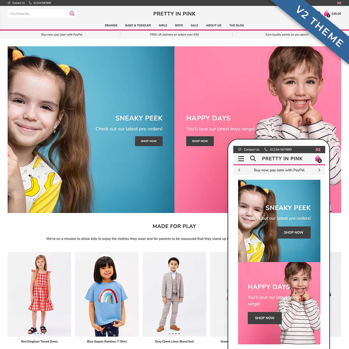
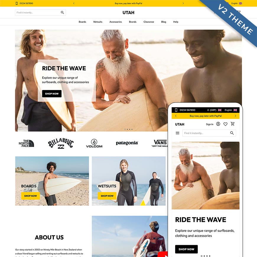
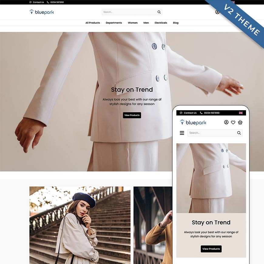
Strong is a mobile-first, full-width theme in a clean black and white colour palette with bold fonts and call-to-actions in deep red. It's perfect for showcasing high quality imagery and storytelling.

Strong is a V2 Theme and can be used with all of Bluepark's features, including the new V2 features.

Theme

  • Built with mobile-first design and functionality in mind
  • Full-width theme
  • Recommended Layout setting is switch off left and right columns on all Layouts

Header

  • Promotional links display within a carousel at the top, if used
  • Optional language/currency drop-downs and telephone number are also displayed at the top
  • Left-aligned search box switches to search icon on mobile
  • Search box slides out from the left on icon click on tablet and mobiles
  • Centre-aligned logo
  • Right-aligned account and basket icons
  • Account and wish list icons display in slide out menu on mobile
  • Centre-aligned top navigation, displaying within the hamburger menu on all tablets and mobiles

Footer

  • Social media icons appear at the top
  • Footer links and email newsletter sign-up form display together
  • Copyright and card payment images display at the bottom
  • See Documentation tab for recommended column setup

Category Page

  • Recommended Layout setting - Main column only
  • Refine button and Sort By button appear at top of product list
  • Centre-aligned sub-category details
  • Centre-aligned and product details
  • On mobile, Product and Category Lists utilise all available space by removing side padding on product images
  • On mobile, Product Lists has one featured product set as full-width on every 7th product

Product Page

  • Recommended product image setting is Gallery, excluding mobile
  • On mobile, all available space is utilised by removing side padding on product images
  • Product tabs display content within an accordian below call-to-action
  • Recommend add to basket dialog position setting is Top Left

Blog

  • Recommended Layout setting is to switch off right column and assign Blog Categories block to Main Column at the top

Default Theme Colours

 ColourHEX Code
Main colour Black#232323
Secondary colour Light Grey#f4f4f4
Highlight colour Red#be152b
Font colour Black#232323

Default Theme Fonts

 Font NameFont SizeFont WeightFont Style
Logo font'montserrat',sans-serif30pxBlack (900)None
Title font (h1)'montserrat',sans-serif28pxBold (700)None
Sub-title font (h2)'montserrat',sans-serif20pxBold (700)None
Main font (p)'montserrat',sans-serif14pxNormal (400)None
Main block title'montserrat',sans-serif28pxBold (700)None
Side block title'montserrat',sans-serif17pxBold (700)None
Button font'montserrat',sans-serif13pxBold (700)Uppercase

Recommended Image Sizes

 WidthHeight
Slideshow (full-width)2500px1250px
Category thumbnails800px800px
Product Large / Zoom1450px1450px

Recommended Footer Columns

 Recommended content
Column 1Links
Column 2Links
Column 3Links or location address
Column 4Email newsletter form
Social media icons are automatically added above the main columns.

Recommended reads

Need help with this theme?

Contact SupportContact Bluepark Support

Benefits of All Bluepark Themes

All of Bluepark’s FREE themes are mobile responsive, extremely flexible and easy to customise to suit your business. Themes can be designed behind the scenes whilst customers see your live site, allowing you to continually update the look and feel of your online shop, or create a brand new design.

Compatible with all built in and manually created blocks
Compatible with all Bluepark features across all packages
Optimised for mobile, tablet and desktop, on all modern browsers
Fully customisable to create your own unique design
One, two or three column layouts available on every page
Continually updated to stay in line with design trends

Try Bluepark for FREE for 14 days

Full access to everything including our support team, no card details required