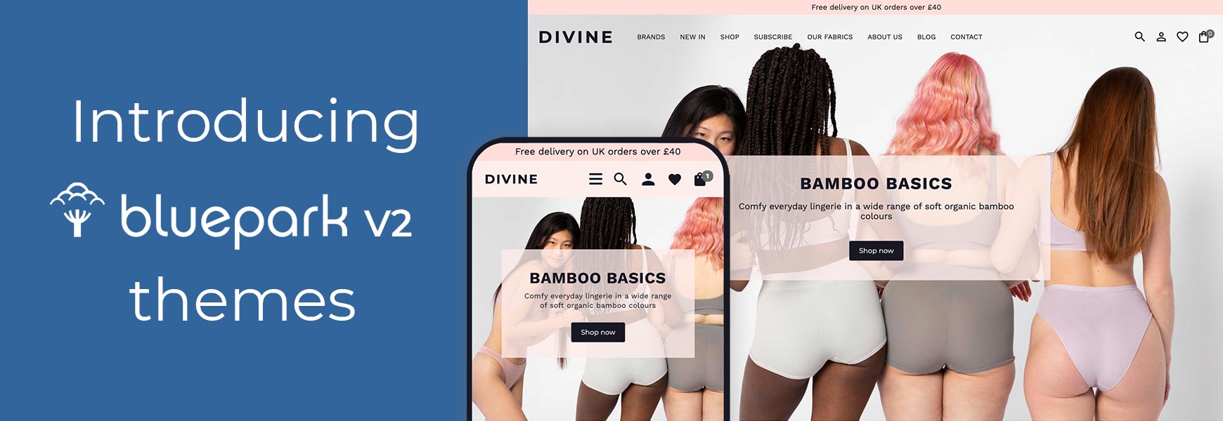
Today, we're excited to introduce you to the brand new Bluepark V2 Themes, available for you to use right now within your admin panel. Why have we upgraded our themes?We've upgraded the Bluepark theme system to bring it inline with modern standards, including HTML5, Google's Core Web Vitals and to ensure sites are completely responsive. This allows us to offer themes that are easier to use, are more automated, and ensures your website is as fast as it can be, so it is optimised for Google's requirements for modern, user-friendly websites. The V2 themes also allow designers and developers to create themes that are extremely flexible, completely bespoke and, therefore, fit your needs as a brand. Areas such as the header, the product page and the basket give them much more freedom to design the site in completely unique ways. We can't wait to see what they come up with! There are many changes that function behind the scenes, as well as the updates and features you'll see within your admin panel and website. For instance, areas such as the header, top navigation, lists of products and categories, and the footer are now automatically fully responsive. All of our built-in blocks are also now fully responsive, can be set to full-width and be viewed using a carousel, making it easier for you to create a site that is modern and engaging. What's changed?The technical changesA completely rewritten HTML5 framework for the online shop - this brings your online shop inline with modern coding standards. Removal of all HTML tables associated with the way each page is laid out - making it easier for the site to be fully responsive. Completely rewritten, fully responsive CSS - there's now no need for separate mobile fields within the theme. Deferred loading of fonts and all JavaScript, including jQuery - to ensure your website's content is loaded for the visitor as quickly as possible. A huge reduction of reliance on JavaScript and third party frameworks - to stop your site having to wait for external servers to respond when it loads, making your site faster. Much less code - less code means faster performance! The Themes menu and Theme Editor changesWe've renamed Templates to Themes - this is purely to use the most common industry term to remove any confusion. Themes function exactly as they did before, allowing you to change what displays on any page using Content Blocks. The Design menu now has a Themes sub-menu -this includes Site Theme, where your default theme and its settings can be found, Installed Themes (previously called Template Manager), and the Theme Library. The 'Mobile' setting in Installed Themes has gone - the theme will automatically adjust to fit on smaller screens. Therefore, if you use different themes for different sections of the site or for different Customer Groups, this removes the limitation of only being able to use one theme on mobile. Many unnecessary or confusing fields have been removed - an example of this is the Header Height and Footer Height fields as these are no longer necessary. The V2 system simply adjusts the header and footer height based on the content that's added to them. The Mobile CSS field has been removed - all responsive control is done either by the V2 code behind the scenes or added as media queries within the CSS field specifically for that theme. A few new fields have been added - we've kept these to a minimum and have only added a new field if it's absolutely necessary. For example, we've removed the Title Bar Height within the Blocks tabs of the theme and replaced it with Title Bar Padding. New variables have been added to insert specific widgets into the design - an example of this is the Search field, Account links and Navigation Bar, which are now added to the header via widget variables, rather than within settings in the theme. EDIT button on Header and Footer Content fields has been removed - you are now only able to edit the Header and Footer via the HTML code. The reason we have done this is to ensure they remain responsive. If you are unsure of how to edit HTML/CSS, we recommend you don't change these areas. Instead, there are plenty of new options to add information into these areas outside of the Theme itself. The front-end website changesFront-end editing has been upgraded - the first thing you're likely to see is that we have completely updated the front-end editing area. Instead of a black bar appearing across the top of the page, when you're logged in as an admin, you can now access the same sections by clicking on the Edit button on the left of the screen. You can still edit the page's Content, Theme and Layout directly from the page, as well as adding, editing and removing blocks. Moving blocks is now easier by dragging and dropping them within the Blocks list. Consistency - one thing you may not immediately notice on the website itself is how thing like borders, fonts, spacing around sections and other styling elements have become more consistent. From a designers point of view, this ensures the look and feel of the site is as professional as it can be, which helps you to build trust - something that's vital for encouraging people to buy from your business. Built-in blocks - we've added new features to our blocks to allow you to set them with a background colour, if you wish, and whether they should be full-width or display with the center of the screen. Built-in blocks, such as the Latest Reviews and Recent Posts blocks can also be set to display horizontally and product, category, blog and review blocks can be set to display as a carousel. We've also separated the Currency and Language into two blocks, allowing you to place these in different locations on the site, if needed. Slideshow - you now have more control over how images uploaded to the slideshow display on all devices, creating a better experience for your customers. MP4 videos can now be added to the slideshow and text, button and link can be added to them exactly as you would add them to images. The text area can also be animated and the styling of the controls can be changed to suit your theme. Image Gallery block - This brand new block works similarly to the V2 Slideshow, but shows all images/videos on the page at once in a set number of columns of your choosing, rather than scrolling one by one. This block can be used for a variety of content, including a straight forward gallery, where each image/video opens in a lightbox to allow the visitor to view a larger version. Alternatively, use it to guide visitors to specific areas of your site by adding heading text, a sub-heading, button and a link to each one. Image Carousel block - this works exactly as the Image Gallery block but displays the images/videos in one line as a carousel. Set the number of columns to determine how many images show at once. Columns block - the new Columns block is a way to add content to a block with a set number of responsive columns. This should be used instead of adding tables to ensure the content displays correctly on all devices. Each cell within the columns can contain text, images, videos, HTML, JavaScript and jQuery. Header Links - new fields have been added into the Theme Overview to allow you to display up to three promotional messages. This can also be used to add in a simple announcement, simply by filling in just one link title and leaving the URL field blank. Up to three messages can be displayed as a carousel, if you wish. Header features - certain features are automatically built into V2 themes, such as displaying a Contact Us link, your telephone number and currency and language selectors. The telephone number can easily be switched off in the Theme Overview, if you didn't want it to display. The currency and language selectors will only appear if you choose to switch on different currencies or languages. Navigation Bar - the navigation links, as set within Design > Navigation Bar, now adjust based on the width of the screen you're viewing the site on. So, on smaller screens, such as tablets and mobiles, the navigation links are automatically shown within a slide-out side menu accessed via the hamburger icon. This removes the limitation of the navigation menu on mobile being populated from the links within Products > Categories. Carousel - you will find the carousel feature in a multitude of places on the V2 themes, including the slideshow and product images on both the category page and the product page. Content Blocks can also be set to carousel style, so you can add product carousels, category carousels, brand carousels and so on. Product and Category Lists - all product and category lists, whether within a page or within a block, will now automatically change the number of columns shown depending on the width of the screen. If you have more than one page of products, a Load More button will appear at the bottom of the page, allowing all products to be listed below the previous ones. Wish List button - the Wish List button is now displayed as an icon, rather than a button, and is shown as filled when the item has been added. It can also be set to display on category pages, so customers can add to their wish list without having to go into the product page. Email a Friend button - the Email a Friend button is also displayed as an icon and the email form will appear in a pop-up, rather than taking the customer away from the product page. Product Images - all alternative images can now have their own name, which allows you to optimise all images for SEO. This also removes the issue of all images having the same file name, with a [1},[2}, etc at the end, as well as alternative images being deleted or added to other products unexpectedly. Product Videos - videos can be assigned to a product to appear within the images area, making them more obvious to the customer. Product Options - options can now be displayed as buttons, as well as drop-downs or radio buttons. These can simply be set as text buttons using the Option value names, as abbreviated text, such as S,M,L, display small images, or display as colour swatches. The image and colour swatch buttons can also be shown underneath the product on a category page. Footer Links - links that appear within the Footer are now managed in their own section within the Design menu. This works by grouping links into columns, each with its own heading. An email sign-up form can also be quickly added, along with social media icons. Social Media links - when the social media icons are added to the Footer, they will only display the ones you add links for. This is managed within Settings > Integrations > Social Media tab. One-Page Checkout - the checkout can now be set to One-Page, so the customer stays on the same page throughout the checkout process. The new Order Summary and Shopping Basket blocks help to keep the customer informed as they progress and the integrated Google Map feature will show them where the order is going once they complete their order.
You can find a full list of all updates and new features for our V2 themes below. We have a number of future V2 updates planned that will be listed here too, as soon as they are released. Explore the full list of V2 featuresChanges for advanced usersHTML standard tags - we've now added in more HTML standard tags, such as <main> around the area between the header and footer, <section> around each block, and <article> around blog posts. Page types classes - the page type class has now been moved to the body tag. Block classes - it's always been the case that all blocks have their own ID, such as #cb_id_1, however now every built-in block has a class applied to it to determine the type of block it is. For instance, the Slideshow block has the class of .block_slideshow. Any copies you make of this block will then have it's own unique ID, plus the block type class. This can then be used to style all instances of the this block on the site in one go. Custom classes - all layouts and blocks now have a Class Name field, where you can add your own custom class that's unique for that specific layout or block.There's also a Head Section field, a Move to Body option and an Onload Values field for every layout and block, allowing you to add targeted code quickly and easily. How can I upgrade my online shop's theme to V2?As the theme structure has been completely rewritten, you can't simply click a button to upgrade a V1 theme to a V2 one. Instead, you will need to use one of our new built-in V2 themes, all clearly labelled within the Theme Library. All V2 themes are designed with best practices in mind and are ready for you to use out of the box. Therefore, it is recommended that you have a read of each theme's features and styles within the Themes area on our website. You can also find out about which colours and fonts it uses, and recommended images sizes, and footer columns. You can then pick one that has the features and styling you require. Colours can easily be changed, so there is no need to choose one based on colours alone. Visit Bluepark ThemesHow to install a new V2 theme
As with all Bluepark built-in themes, V2 themes are completely free and we will be releasing many more over the coming months. What happens if I don't upgrade?We highly recommend that you do upgrade but, if you choose not to, your site will continue to function as it currently does. However, this will mean that you won't benefit from any of the improvements and features above - all of which have been implemented to improve SEO and your customers' experience. There is no time limit to upgrade. V2 Theme SupportWe will be adding more help guides and videos shortly, but if you have any questions about our V2 themes or are unsure of how to do something, please get in touch with our Support Team. Contact Support Team
Try Bluepark for FREE for 14 daysFull access to everything including our support team, no card details required |
|

× Create your free trialGet started for FREE for 14 daysWe recommend building your online shop on a desktop device for the best possible experienceAlready have a free trial? Sign In Now |
|