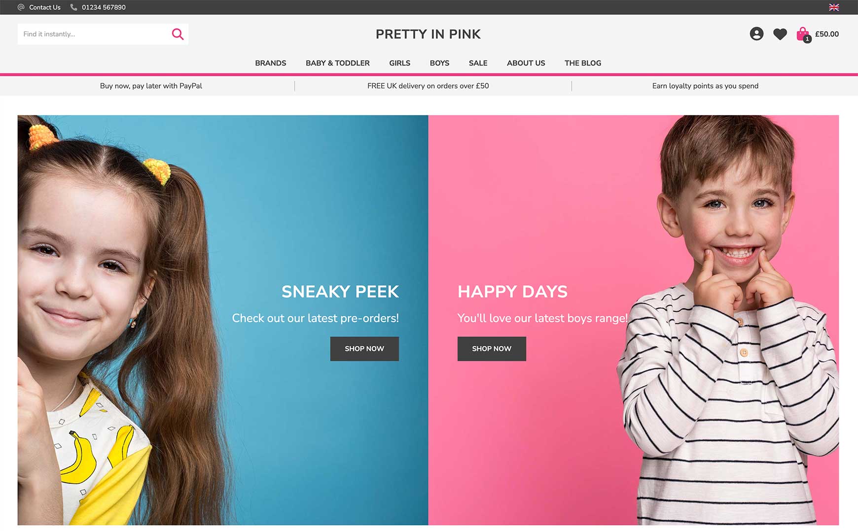
The new V2 Image Gallery block and Image Gallery Carousel block allow you to add multiple images and videos to a page, all with their own optional text, button and link. The blocks can be used for a multitude of engaging content sections on your online shop, on the homepage, as well as all other pages. The new Image Gallery block works in a very similar way to the Slideshow, but instead of showing images one at a time, it shows all of them on the page at once. A great example of this can be seen on yashar-bish.com, as shown below. Here, they have created a gallery of photos from their travels when on buying trips and each one can be viewed on the page and then via the lightbox zoom by clicking on each one. Another example can be seen on our Pretty in Pink theme below, where we have used the Image Gallery block instead of the Slideshow block to display at the top of the homepage. Here, we have simply added two images and then added text, a button and a link to each one to take the visitor through to the relevant category.
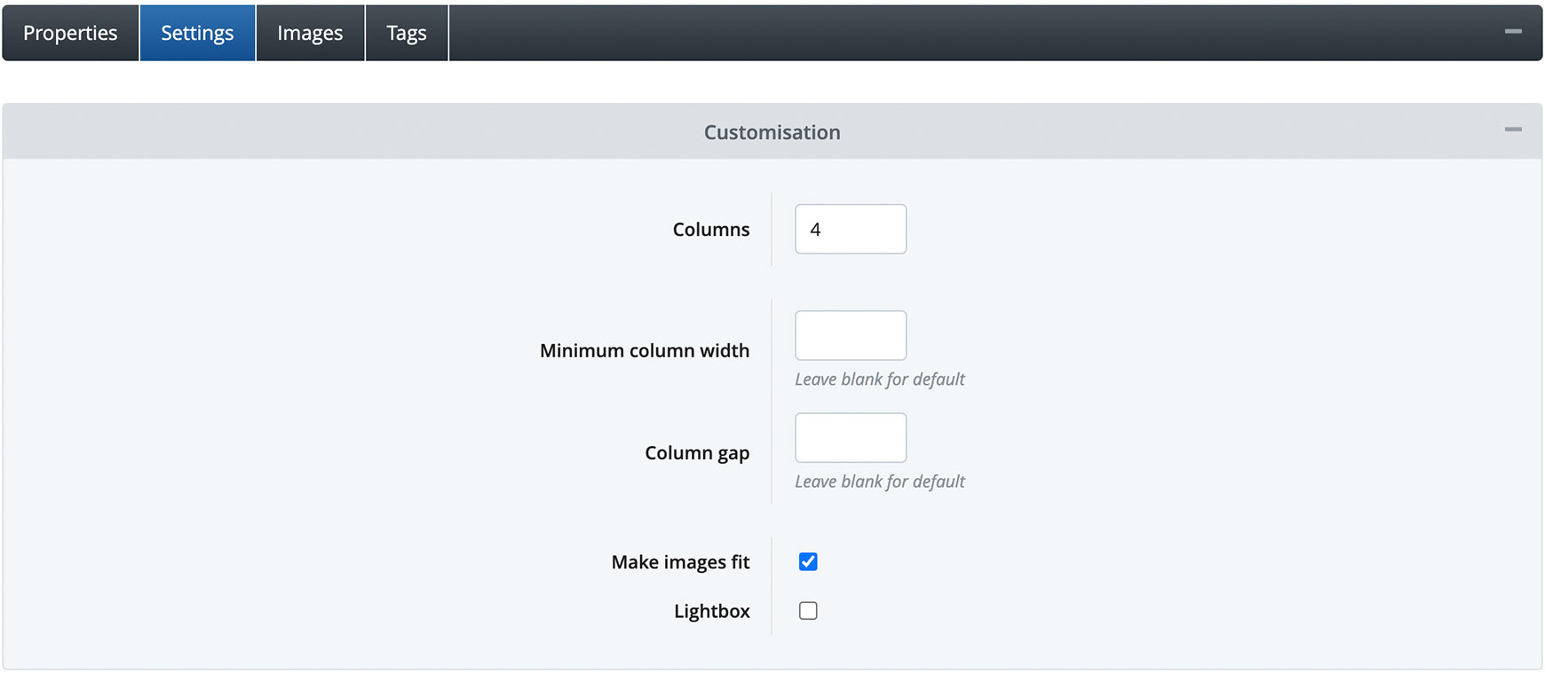
Please note, the new Image Gallery block only works with V2 themes. If you are still using a V1 theme on your site, you will need to upgrade to a V2 theme in order to use it. We recommend watching our Introducing Bluepark V2 Themes video and having a read of our Introducing Bluepark V2 Themes guide before you start. Setting up your Image Gallery blockTo create your Image Gallery block, go to Design > Content Blocks and find the Image Gallery block. It's always advisable to make a copy of the default block, so you can make multiple copies if needed, and then use the copy for your site. Properties tabIn the Properties tab, give the block a title. If you tick the Show Title Bar option, the Block Title will appear on the site, so make sure it make sense for your customers. Otherwise, simply untick Show Title Bar to just show the Image Gallery itself. 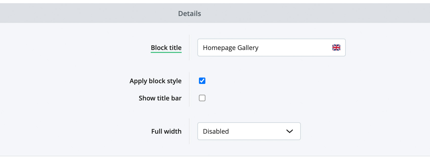 Next, choose how you wish for the block to display. If you simply want it to show within the main content width, then set Full Width to Disabled. If you wish for it to be displayed the full width of the site, then choose Enabled, all content. Alternatively, you can set it to have a full width coloured background and the gallery itself will sit within the main content width by selecting Enabled, background only. Settings tabIn the Settings tab, set the number of columns you want going across the page for your block. For instance, if you want to display 4 images across the page, set Columns to 4.
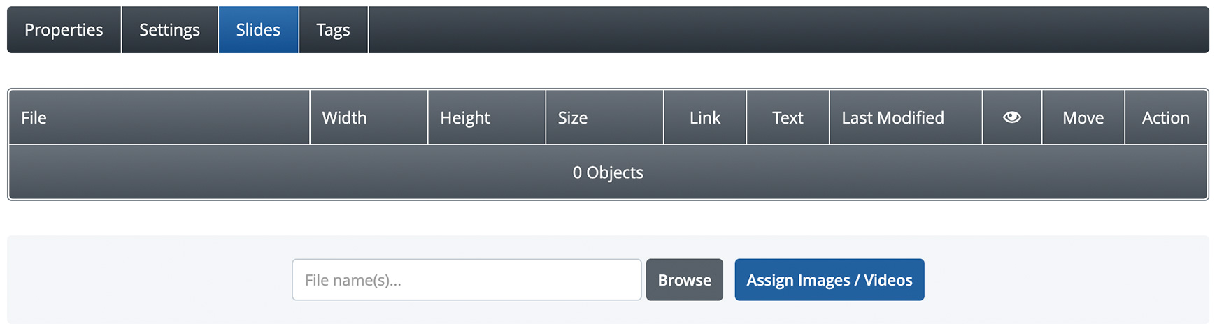
Minimum Column Width and Column Gap are both advanced settings and can be left blank, so they will use the settings within the theme. However, if you wished to remove the gap between the images, as shown in the Pretty in Pink example above, simply set Column Gap to 0. It is advisable to tick Make Images Fit because this will take into consideration any images that have different aspect ratios, i.e. if the proportion between the image's width and height differs per image, and will make sure they all fit the column in full for consistency. Lastly, Lightbox should only be ticked if you want the visitor to click on each image to open up a larger zoom image, as shown in the video of Yashar Bish's site above. If you want to add links to each image, then make sure this is unticked. Slides tabThe Slides tab is where you add your images and videos. Simply click on the Browse button at the bottom and locate the files on your computer. You can upload multiple images and videos at the same time, if you wish, just hold the Cmd or Ctrl button on your keyboard and then select your files.
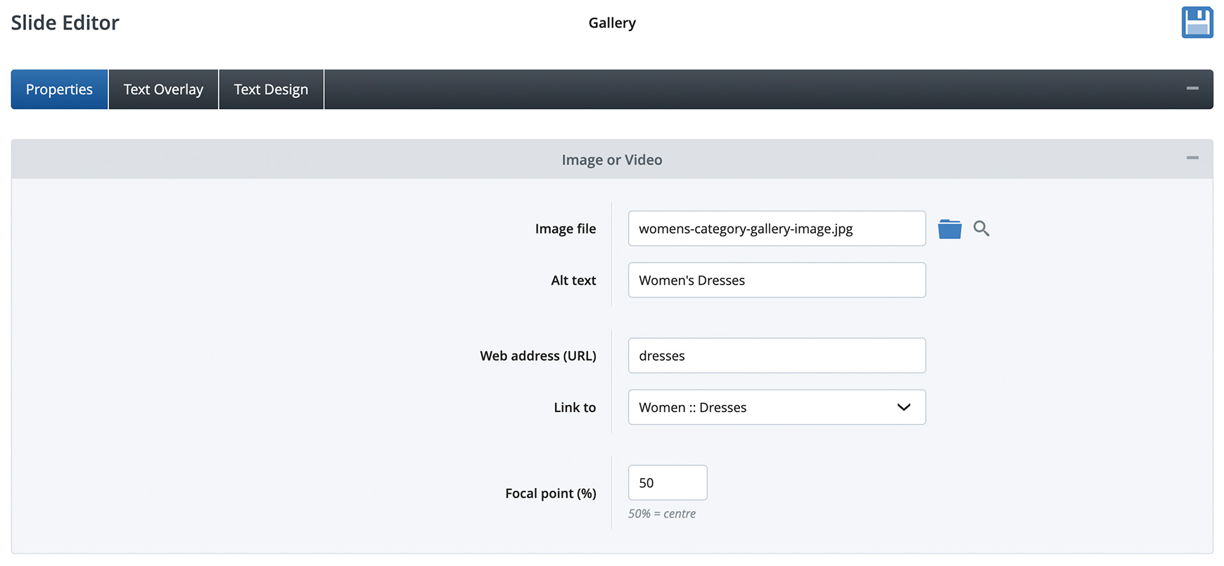
Adding content to your images and videosOnce you've added your images and videos, you can then add content to each one, such as text, buttons and a link, by clicking on the file name or Edit icon within the Action column. Properties tabWithin the Alt Text field, type in a short description of the image or video for SEO and visually impaired visitors. You can then add a link to the image either by typing it directly into the Web Address (URL) field or selecting it within the Link To drop-down.
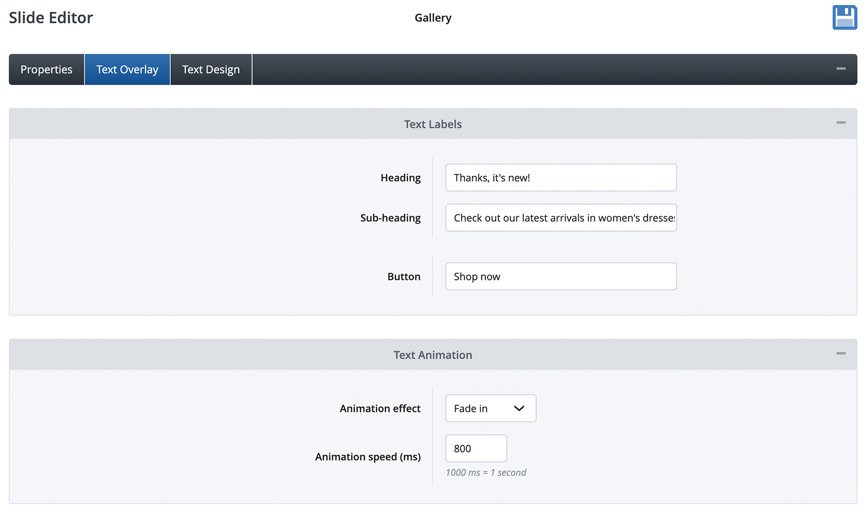
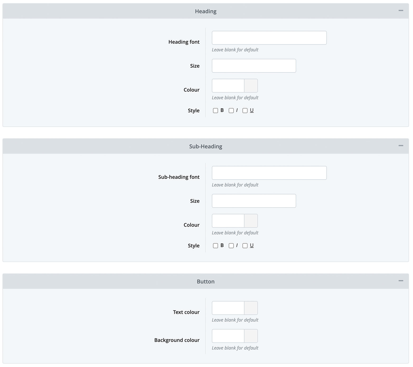
Lastly, you can set a Focal Point for the image. This is the percentage from the left of the image that remains in focus on all screen sizes. For instance, if you set it to 50%, the centre of the image will always remain in focus. This setting is only relevant if your images are landscape in orientation, i.e. wider than they are in height. Text Overlay tabIn the Text Overlay tab, you can set a Heading, Sub-heading and Button. The Heading should be short and punchy to grab visitors attention, ideally no more than just a few words.
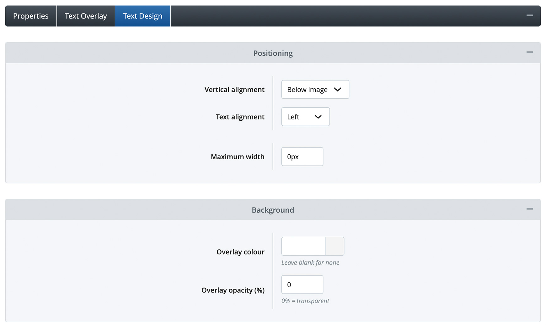
The Sub-heading can then be used to expand a little on the header, if needed, but, again, it should be kept as short and as simple as possible. If you've added a link to the image, it is recommended to add a Button with a short call-to-action, such as ‘Shop Now’ or ‘Explore More’. In the Text Animation section, you can choose to animate how the text displays on the slide as it loads. In the Animation Effect drop-down, you can set how it animates, such as sliding in or fading in or has no animated effect. The Animation Speed (ms) sets how long the text takes to display. By default, this is usually set to 800, which is an average speed. However, if you wished to slow it down slightly, you would change this to 1000 or make it faster, you would change it to 600. Text Design tabThe Text Design tab is where you can style the text for each image. Within the Positioning section, you can choose where you want the text to appear in relation to the image. In Vertical Alignment, you can overlay the text on top of the image by choosing Top, Middle or Bottom. Alternatively, you can choose to display the text underneath each image by selecting Below Image. It is recommended to ensure this setting is the same for each image to create consistency and avoid a messy looking page.
Text Alignment specifies the alignment of the text within the text area. You can set this to Left, Centre or Right. Lastly, you can set a Maximum Width, if necessary. This is usually used if wanted to limit the width of the text when it is overlaid on top of the image to ensure the image can be seen well. Leaving this as 0px will simply allow the text to fill the width of the text area. Within the Background section, you can set an Overlay Colour and Overlay Opacity. The Overlay Colour will add a background colour to the text and the Overlay Opacity will set how transparent the background colour will be.
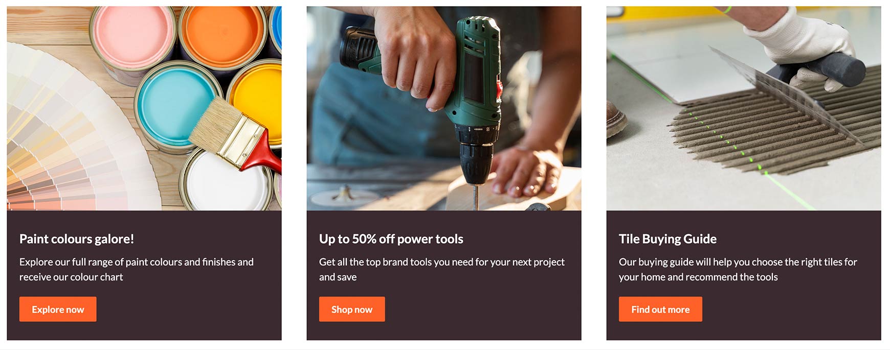
If you set Vertical Alignment option to Below Image, the Overlay Colour will fill the area behind the text (as shown above). In this instance, the Overlay Opacity would most likely need to be 100%, so it is a solid colour.
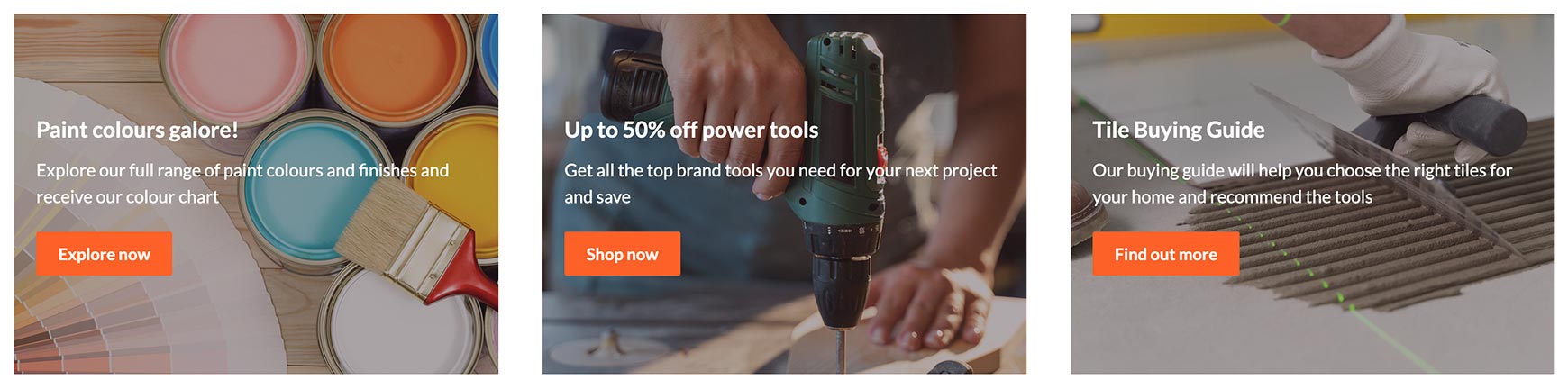
Whereas, if you set Vertical Alignment to Top, Middle or Bottom, the overlay will cover the whole of the image and will be layered between the image and the text (as shown above). Therefore, the Overlay Opacity would need to be set to a much lower percentage, such as 30%, to ensure the image can be seen. This can be useful if the image is quite busy and needs toning down a little to ensure the text stands out on top of it.
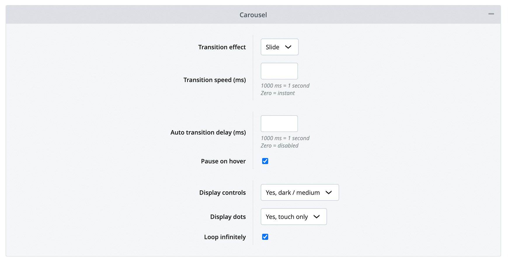
Within the Heading, Sub-Heading and Button sections, you can set text and button styling, if needed. The theme will often take care of these settings for you, so we recommend leaving these fields as they are to start with, checking what the Image Gallery looks like on the site and then making minimal changes only if necessary to ensure consistency. Image Gallery Carousel blockAlongside the Image Gallery block, we've also released the Image Gallery Carousel block. This works in exactly the same way, except that the images are displayed on one line only and are shown as a carousel. Your images / videos are setup as above, but there is an extra section within the Settings tab called Carousel.
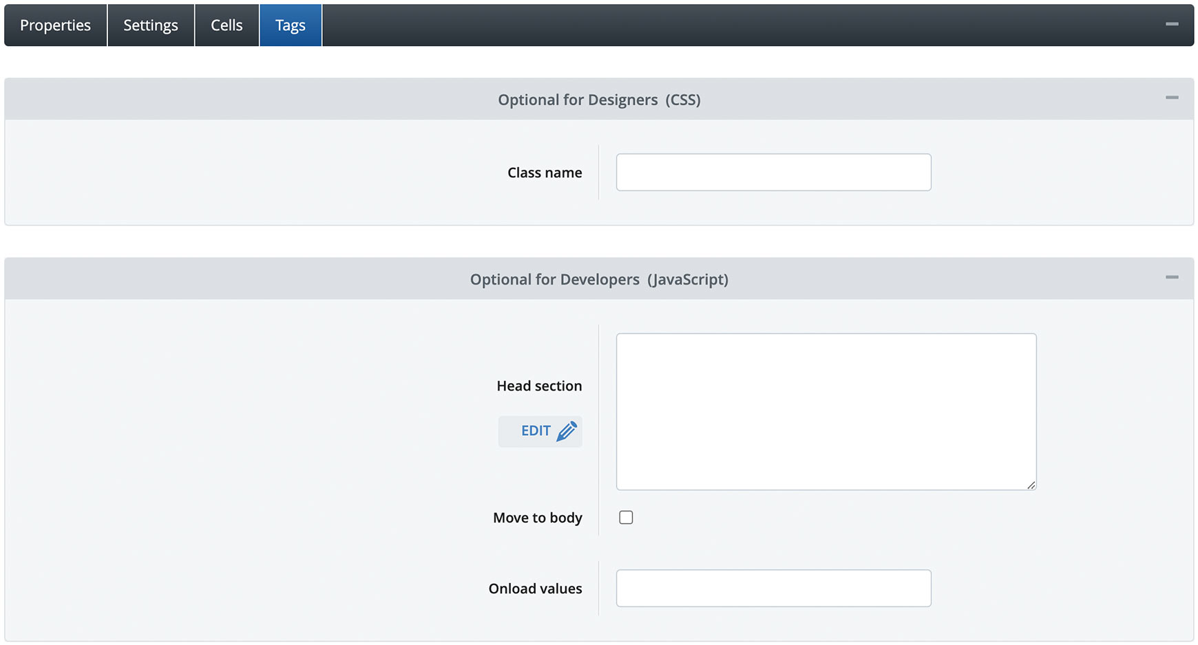
In here, you can set the Transition Speed - which sets how fast the carousel moves - and the Auto Transition Delay - which sets how quickly it automatically moves from one image to the next. If Auto Transition Delay is set to 0, then the carousel won't move automatically and the visitor must click or swipe the carousel to move between the images. The above Image Gallery Carousel block simply shows brand logos, which click through to the relevant brand categories. This is set to a Transition Speed of 1500ms, which moves the carousel fairly fast, but the Auto Transition Delay is set 1ms, which means there's almost no delay before each image is moved. This creates a smooth transition effect. Whereas, the above Image Gallery Carousel block is setup to help visitors navigate to services the site offers and each image has text and a call-to-action button underneath. This carousel is set to a Transition Speed of 2000ms, which moves it a little slower, but the Auto Transition Delay is set 10ms, so there's a slight delay before each image is moved, allowing you to read each one at a time. We recommend playing with these settings to get the sort of transition you wish for your block. Next, you can set the carousel to pause as the visitor hovers over each image, if you wish, giving them time to absorb each one. You can then set your Display Controls styling and where you wish to display the slide indicator Dots. It is recommended that these are set the same on all carousel blocks throughout the site to create a professional look. Lastly, you can choose if you wish for the carousel to Loop Infinitely. Please be aware, this will only work if you add enough images to the carousel, so it has enough to loop around. The way to remember this is that you will always need two extra images than the number shown on the screen. So, if you have your columns set to 3, then you will need to add 5 images and if you have your columns set to 4, then you will need to add 6 images. Advanced SettingsFor designers, developers and anyone who is confident with HTML, CSS, JavaScript and jQuery, each block now has extra settings within the Tags tab. Blocks have always their own ID, such as #cb_id_1, however every built-in block now has a class applied to it to determine the type of block it is. For instance, the Image Gallery block has the class of .block_gallery. Any copies you make of this block will then have it's own unique ID, plus the block type class. This can then be used to style all instances of the this block on the site in one go.
On top of this, all blocks, including the Image Gallery block, have a Class Name field within the Tags tab, where you can add your own custom class that's unique for that specific block. This can then be targeted within the Advanced CSS and Responsive CSS fields in the theme. There's also a Head Section field, a Move to Body option and an Onload Values field within every block, allowing you to add targeted code quickly and easily. Recommended reads Get acquainted with the new V2 Columns block The new Columns block allows you to add your own bespoke content to your website in a responsive grid-like fashion without the use of tables.  Best practice design for V2 basket & checkout The new V2 one-page checkout will help improve your customer's experience, leading to less people abandoning their basket. Set yours up today! Try Bluepark for FREE for 14 daysFull access to everything including our support team, no card details required |
|

× Create your free trialGet started for FREE for 14 daysWe recommend building your online shop on a desktop device for the best possible experienceAlready have a free trial? Sign In Now |
|