The new Columns block allows you to add your own bespoke content to your website in a grid-like fashion without the use of tables. Bluepark then takes care of the responsiveness automatically, ensuring your content displays correctly on all devices.
You can add any front-end content to the Columns block, including images, videos, icons, GIFs, text, HTML, jQuery, JavaScript and so on. You simply set how many columns you wish to display across the page and then add your content to each Cell of the grid.
Please note, the new Columns block only works with V2 themes. If you are still using a V1 theme on your site, you will need to upgrade to a V2 theme in order to use it. We recommend watching our Introducing Bluepark V2 Themes video and having a read of our Introducing Bluepark V2 Themes guide before you start. Setting up your Columns blockTo create your Columns block, go to Design > Content Blocks and find the Columns block. It's always advisable to make a copy of the default block, so you can make multiple copies if needed, and then use the copy for your site. Properties tabIn the Properties tab, give the block a title. If you tick the Show Title Bar option, the Block Title will appear on the site, so make sure it make sense for your customers. Otherwise, simply untick Show Title Bar to just show the Columns content. 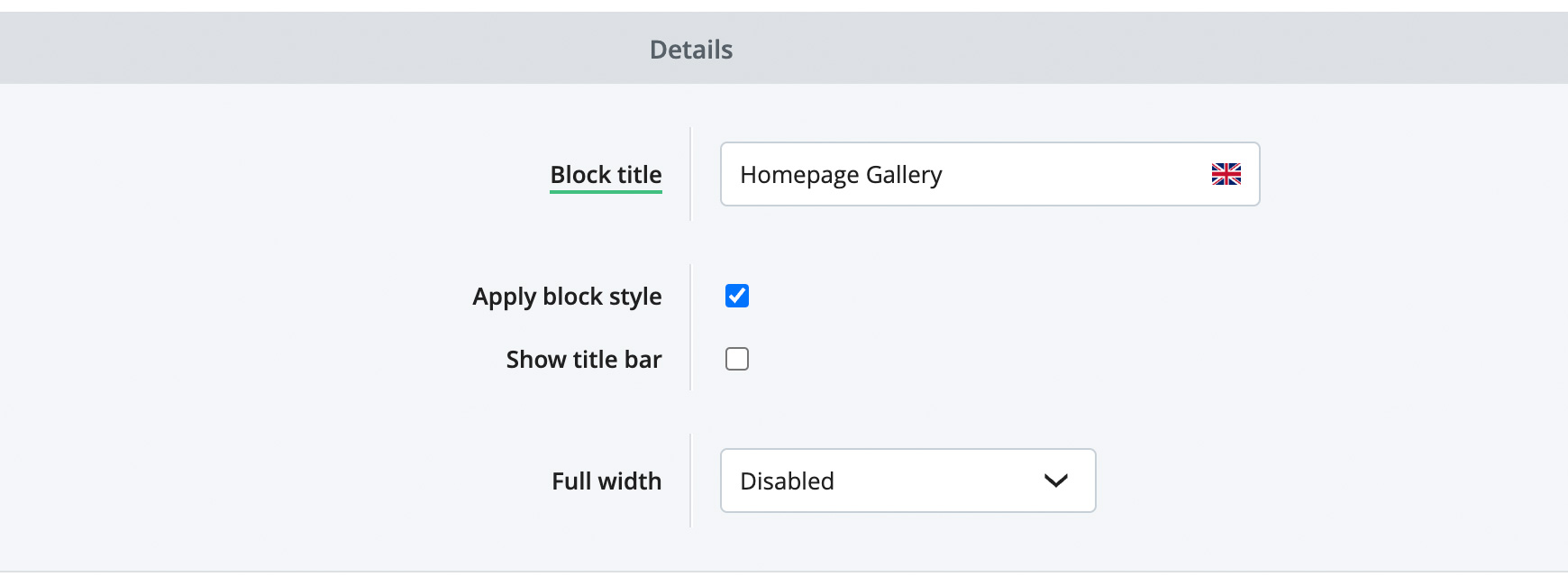 Next, choose how you wish for the block to display. If you simply want it to show within the main content width, then set Full Width to Disabled. If you wish for it to be displayed the full width of the site, then choose Enabled, all content. Alternatively, you can set it to have a full width coloured background, and the Columns content will sit within the main content width, by selecting Enabled, background only. Settings tabIn the Settings tab, set the number of columns you want going across the page for your block. If you then add more content cells than the number of columns, these will displayed on rows below the first content cells. For instance, if you set Columns to 4 and then add 8 Cells with content in them, this will display as 4 columns across and 2 rows down.
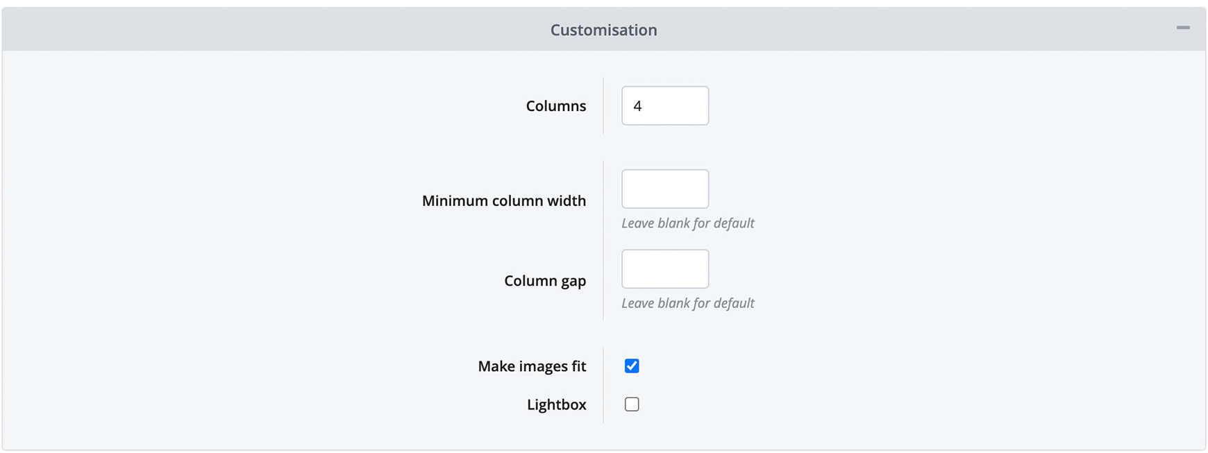
Minimum Column Width and Column Gap are both advanced settings and can be left blank, so they will use the settings within the theme. However, if you wished to remove the gap between the columns, simply set Column Gap to 0. Lastly, you can choose if you wish the columns to be displayed in a Carousel. This means they will be displayed on one horizontal line and the customer can scroll through each one. Once this option is ticked, click on the Save icon to show the Carousel settings.
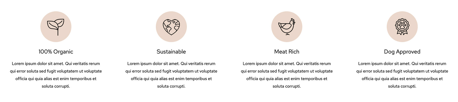
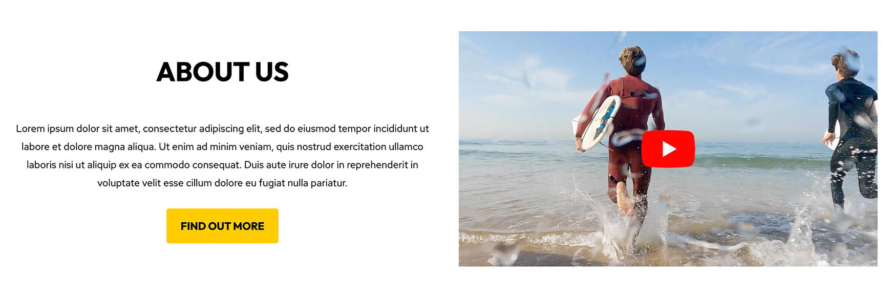
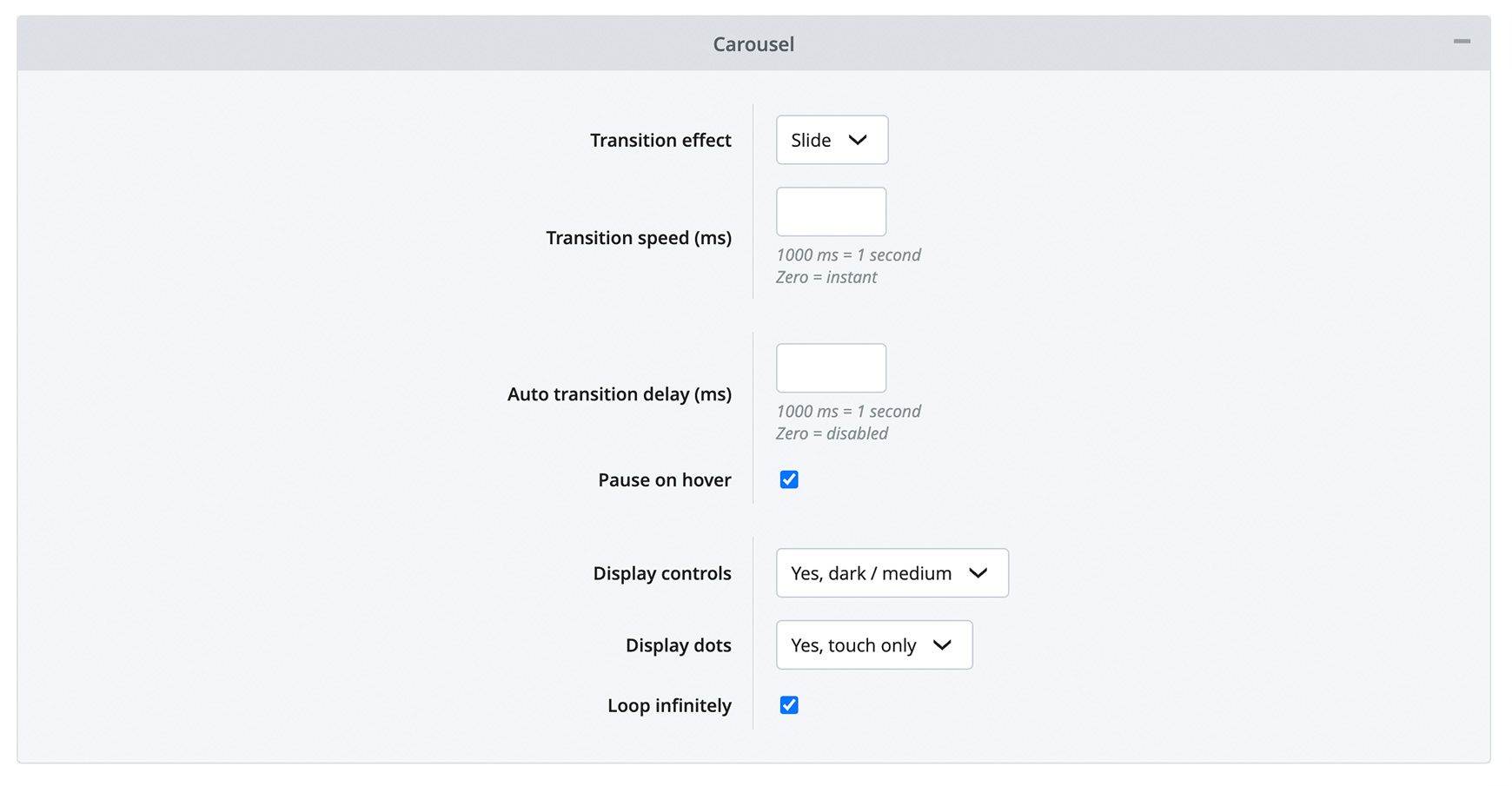
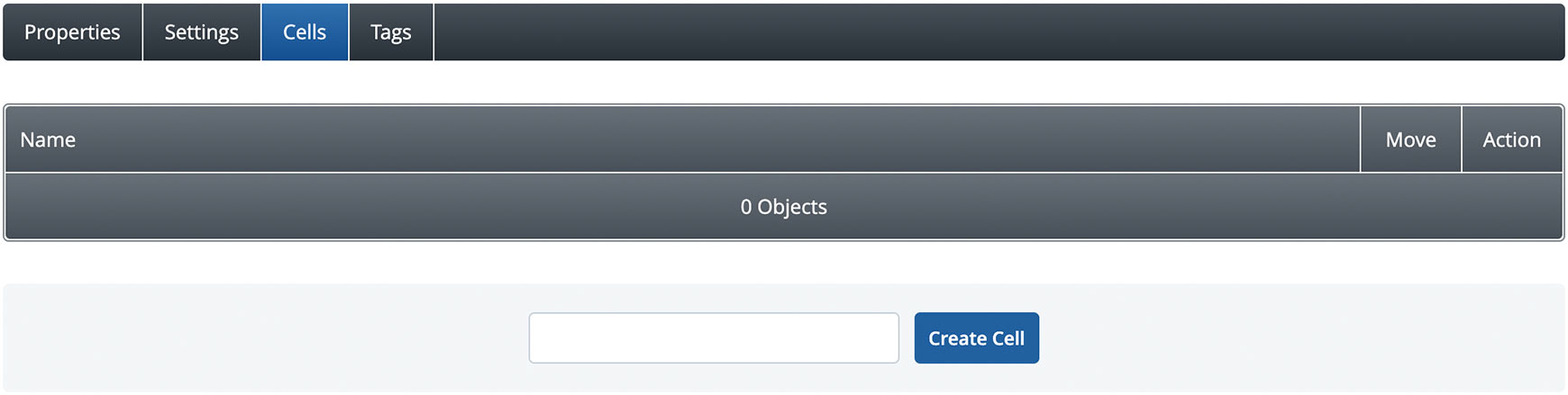
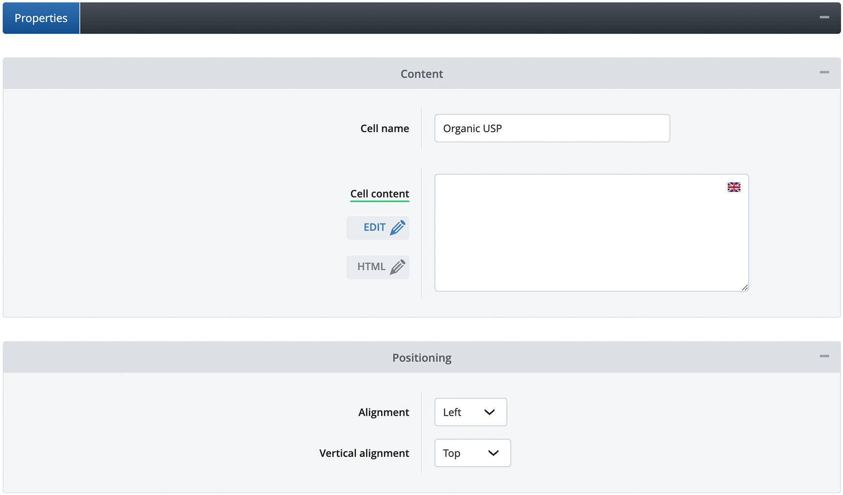
Here, you can set the Transition Speed - which sets how fast the carousel moves - and the Auto Transition Delay - which sets how quickly it automatically moves from one cell to the next. If Auto Transition Delay is set to 0, then the carousel won't move automatically and the visitor must click or swipe the carousel to move between the cells. We recommend playing with these settings to get the sort of transition you wish for your block. Next, you can set the carousel to pause as the visitor hovers over each cell, if you wish, giving them time to absorb each one. You can then set your Display Controls styling and where you wish to display the slide indicator Dots. It is recommended that these are set the same on all carousel blocks throughout the site to create a professional look. Lastly, you can choose if you wish for the carousel to Loop Infinitely. Please be aware, this will only work if you add enough cells to the carousel, so it has enough to loop around. The way to remember this is that you will always need two extra cells than the number shown on the screen. So, if you have your columns set to 3, then you will need to add 5 cells and if you have your columns set to 4, then you will need to add 6 cells. Cells tabThe Cells tab is where you add your content. To create your first cell give it a name in the field at the bottom that explains what it is and click the Create Cell button. So, on our Columns block example at the top of this page, the first cell is called 'Organic USP'.
Once you've created your cell, click on its name to edit it. In here you can change its name, if needed, and then use the Content Editor to add your content by clicking the Edit button next to Cell Content. If you're confident with HTML, jQuery and JavaScript, you can add this by clicking on the HTML button instead.
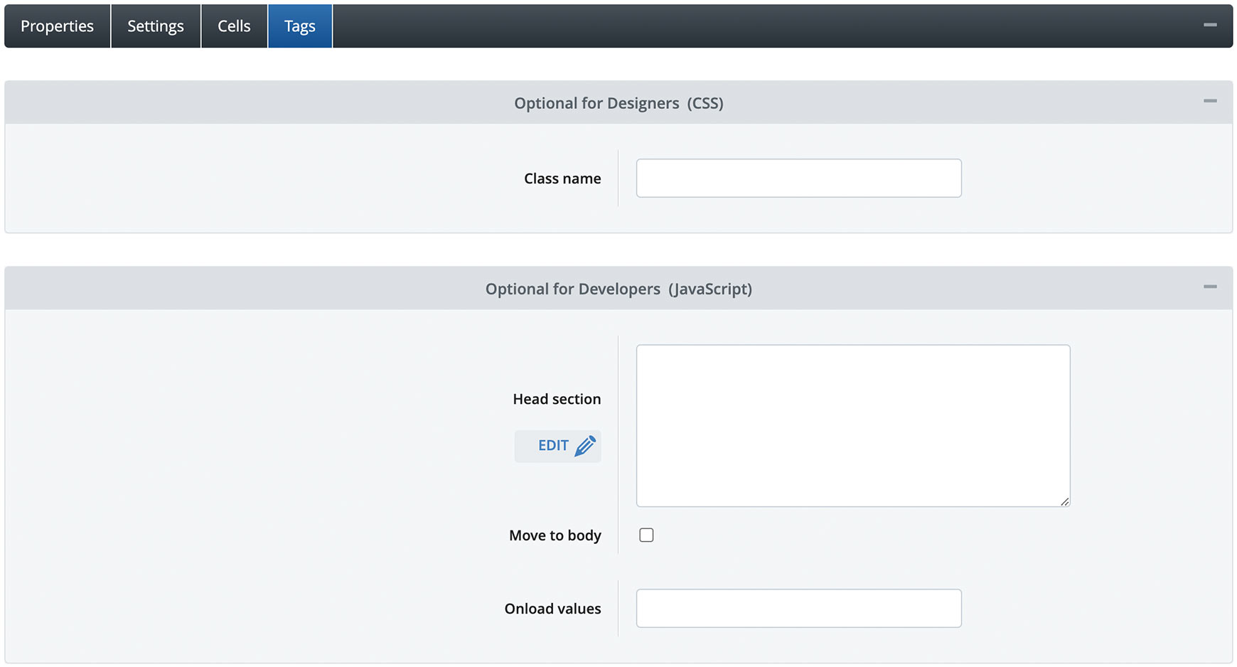
Below this you can set the positioning of the content within the Cell. Alignment sets whether it displays to the left, to the right or in the centre and Vertical Alignment sets whether it displays at the top, the bottom or the middle. Advanced SettingsFor designers, developers and anyone who is confident with HTML, CSS, JavaScript and jQuery, each block now has extra settings within the Tags tab. Blocks have always their own ID, such as #cb_id_1, however every built-in block now has a class applied to it to determine the type of block it is. For instance, the Columns block has the class of .block_columns. Any copies you make of this block will then have it's own unique ID, plus the block type class. This can then be used to style all instances of the this block on the site in one go.
On top of this, all blocks, including the Columns block, have a Class Name field within the Tags tab, where you can add your own custom class that's unique for that specific block. This can then be targeted within the Advanced CSS and Responsive CSS fields in the theme. There's also a Head Section field, a Move to Body option and an Onload Values field within every block, allowing you to add targeted code quickly and easily. Recommended reads Introducing the new V2 Image Gallery blocks The new V2 Image Gallery block allows you to add multiple images and videos to a page, all with their own optional text, button and link.  Best practice design for V2 basket & checkout The new V2 one-page checkout will help improve your customer's experience, leading to less people abandoning their basket. Set yours up today! Try Bluepark for FREE for 14 daysFull access to everything including our support team, no card details required |
|

× Create your free trialGet started for FREE for 14 daysWe recommend building your online shop on a desktop device for the best possible experienceAlready have a free trial? Sign In Now |
|