The most important thing to remember when setting up your product page is that its main purpose is to sell. Our 10 tips to improve your product pages will help you to make sure you don't distract the customer's attention away from this primary goal and keep everything focused on the selling message. 1. A clear and concise product titleA product title should be placed at the top of the product page, either to the left, above the image, or to the right, above the buying options area, and should tell the customer exactly what they are looking at. Keep it simple and clear without using unnecessary words and think about how it will be searched for on Google as this will be used as the link text. If relevant, make sure you include the brand name. Bad Product Title or Dress 34920 Good Product Title
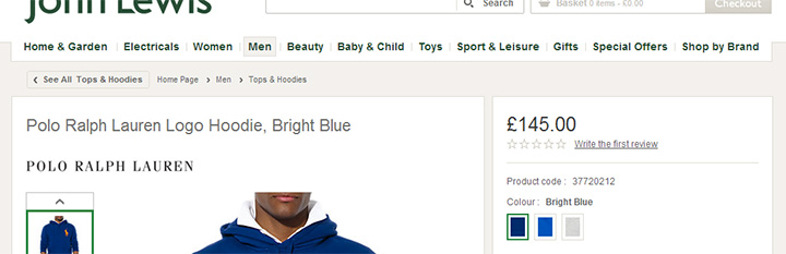
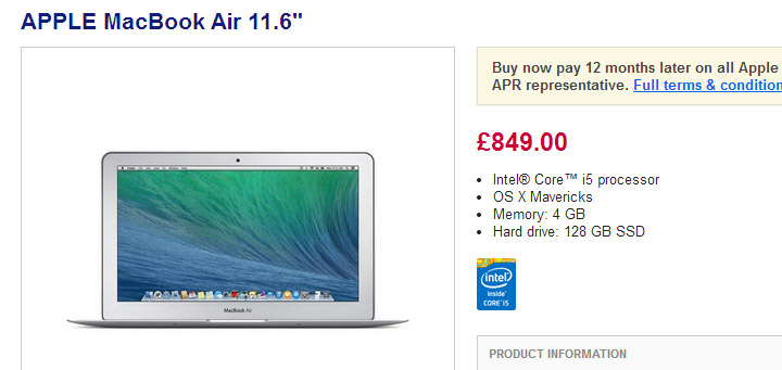
John Lewis do this well with their product title displayed on the left of the page, above the image, and it tells the customer exactly what the product is without being too long-winded. 2. Images that sell your productThe main product image is the first thing anyone will look at on a product page so you need to make sure it sells your product. Many people on the internet skim read text or don’t bother to read anything at all, so ensure that your images explain all relevant benefits to the customer so they don’t miss anything. Don’t just rely on one product shot. Displaying different angles, close-ups, inside of products and even the product in use will help to show the customer exactly what the product is like. Adding a short video can also enhance this. All images should be large and of good quality to really show the product off. Don’t rely on tiny, poorly lit photographs that you take on your mobile. Remember, the customer can’t touch the product, they can’t try it on and they can’t examine its quality, so let the customer ‘experience’ the product on your website through your images. Have a read of our Best Practices for Website Photos and Product Images guide for more information about making sure your product images are as optimised as they can be for your online shop.
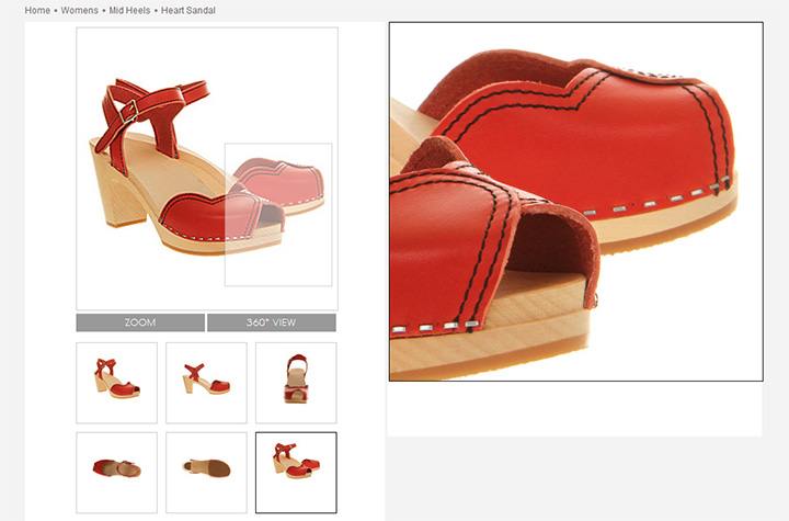
Office display a range of different angled shots of their shoes, all with a high quality zoom, so the customer can really see every part of them. They even add a 360° rotating image to make sure they don't miss anything. 3. Informative PricingThe price of the product should not only clear and well placed but it also needs to be informative so the customer knows exactly why they should purchase from you rather than anyone else. Displaying the RRP or ‘Was’ price alongside the price you are actually selling the product for will tell customers that the product is on offer. Enhance this further by showing the percentage they will save when buying with you.
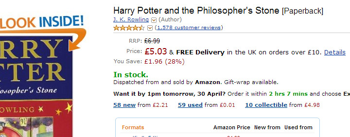
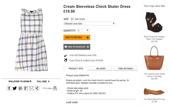
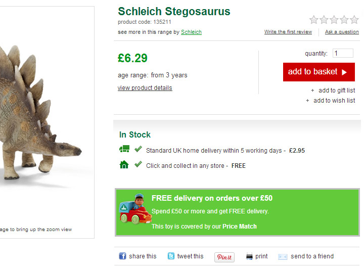
Amazon are very transparent with their pricing showing the RRP price, their selling price and the amount and percentage the customer will save by purchasing with them. They also add a free delivery message next to the selling price to inform the customer how much they are likely to pay in total. 4. The buying options all in one placeEverything relating to the actual purchase process must all be in one place on the product page. Having everything scattered across the page will only result in the customer getting frustrated and eventually leaving your site. Create an area for the product code, RRP/Was price, selling price, percentage saving, product options, product availability, a link to the size guide (if relevant) and the add to basket call to action button. Apply a subtle background colour to give prominence to the area so it is not easily missed.
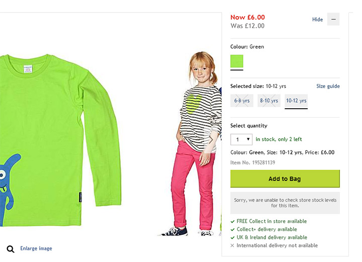
House of Fraser display all of their buying options to the right of the product image and include the price, options such as colour and size, a pop-out size guide, quantity in stock, product code and delivery options. This informs the customer of just about everything they need to know in terms of actually purchasing the product. 5. Easy to spot product detailsEach product has particular reference points that should displayed for quick skimming of the page. These could be Brand or Colour or something very specific to the product, such as Screen Size for TVs or Megapixels for cameras. These allow the customer to make a decision at a quick glance and help them make their mind up whether this is the right product for them faster. Display you reference points or ‘attributes’ close to the buying options so that people can quickly double check they are buying the right item.
Currys have a small number of reference points close to the buying options area. These are the most relevant points someone would look for if comparing similar products and are easy to skim read. 6. Benefit selling product descriptionYour description should tell the customer why this product would benefit them. Ask yourself ‘How will this make my life better?’ and ‘Why should I part with my money and buy this?’ and then use the answers to create your product description. Make sure you include as much information about the product as possible, such as material, dimensions, weight, care instructions, technical details, sizing in relation to the model, and anything else relevant to your product. Don’t write your product description for Google, write it for your customers. They are the ones who will actually be buying from you, so you need to make it as readable as possible. This will also benefit your SEO as Google now rewards well written content over keyword stuffed, meaningless content. If you find your content is becoming too long or too cluttered break it up into readable chunks using Product Tabs. Have one for Product Description and another for Technical Details or Care Instructions.
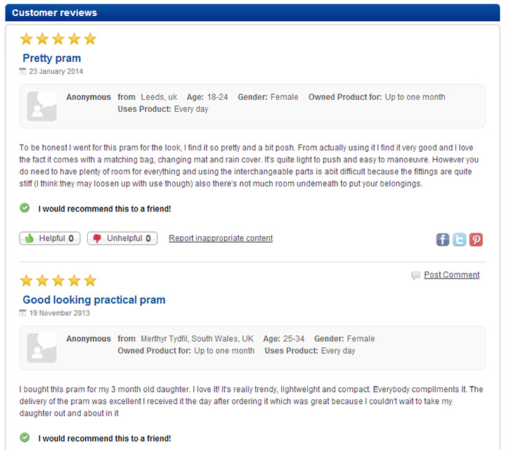
Debenhams make sure all of their electrical equipment has a full and detailed description with a separate tab for the technical specifications. As these are higher priced items they know that customers will take longer to make a decision to purchase and therefore need more detailed information. 7. Allow your customers to sell your products with ReviewsAccording to an iPerceptions study 61% of people read reviews and 63% are more likely to purchase after reading them. This is because visitors to your site will respond better to honest feedback about a product by people who have actually used it rather than you telling them how good it is. Don’t overcrowd your product information with your reviews, though, this should still be focused on selling your product. Add them somewhere below the fold so that people can scroll down to them. You can still promote them in your selling areas, however, by adding review stars and a link to the actual reviews along with the buying options.
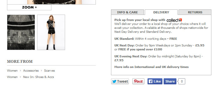
Boots show the review star rating very clearly close to their buying options area and have both a link to the actual reviews and one to encourage the customer to write a review themselves. The reviews themselves are placed at the bottom of the page so they don't distract the customers from the product detail. 8. Delivery & Returns informationIncluding a summary of the delivery and returns information on the product page will prevent the customer from leaving the page in search of this information. Once they’ve navigated away from the product page, and not clicked on the add-to-basket button, they may not return and you could’ve lost a sale. Add your information to a product tab so it doesn’t distract the customer but, is there if they need it. Keep it simple, stating clearly each shipping method, highlighting any offers or free shipping, and include a link to the full shipping information page. For the Returns section add a brief summary of your returns policy, again with a link to the full returns information page.
ASOS use their product tabs to make their delivery and returns information as obvious to their customers as possible. They also show a more info link on both tabs in case the customer wants to read the full policies. 9. Cross selling, up selling and recently viewedCross Selling (offering complimentary products), Up Selling (offering add-ons or upgrades to a product) and Recently Viewed (products previously viewed by the customer) all allow the opportunity to increase the basket size of the customer’s order. However, they also help to encourage the customer to add the product to their basket in the first place. Imagine the customer wasn’t 100% convinced about buying an iPad from your site but, then they see you have an iPad case, as an upsell, that is on offer if you purchase it with the iPad. This can help them to make the decision as they won’t need to then look for a case elsewhere. Placement is very important for these. Ideally cross selling and recently viewed products should be kept away from the main selling area so they do not cause a distraction. However, the up selling will need to be closer as these are optional extras of the main product and are usually added to the basket at the same time.
New Look have a 'You May Also Like' section to the right hand side of the buying options area which shows items that can be worn with the main product. They are far enough away that they don't distract the customer but close enough that they can see what the item of clothing can be matched with, helping them to make a more informed decision. 10. Encourage return purchasing – wish lists, tell a friend and socialWe all agree the main reason for your product page is to make people buy your products there and then but, if someone is just browsing you want to encourage them to return to your site once they do decide to purchase. Things like a wish list, where the customer can add products to a list on your website and come back to it at any time, tell a friend, where the customer can send an email to a someone to let them know about a product on your site, and social share buttons, which allow the customer to share the product with their friends on social networking sites can all help to achieve this.
Early Learning Centre not only have a wish list for you to keep items you'd like to buy for yourself, but they also have a gift list, which can be used for gifts you want to give other people or perhaps use for something like a baby shower. These are placed just underneath the 'add to basket' button for those who are browsing rather than purchasing. They also have a social area underneath the buying options area where the customer can share the product either via their social profiles or via email. Try Bluepark for FREE for 14 daysFull access to everything including our support team, no card details required |
|


× Create your free trialGet started for FREE for 14 daysWe recommend building your online shop on a desktop device for the best possible experienceAlready have a free trial? Sign In Now |
|