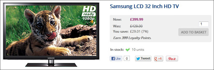
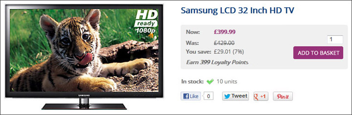
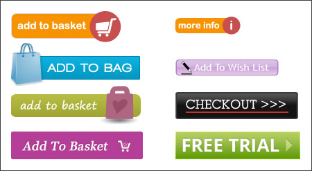
What are call to action buttons?You place Call to Action buttons on your website to tell the customer to do something. These can be as simple as a ‘Continue’ button or as important as ‘Add to Basket’ or ‘Checkout’. These buttons are sometimes overlooked when websites are designed but a badly designed Call to Action button can greatly reduce your customer’s user experience and, in turn, damage your conversion. Why are they important?Visitors to any ecommerce website will make a decision within seconds about whether to continue on or leave your site entirely. You need to make it absolutely clear to the visitor what they need to do next with a call to action. They need to catch the visitor’s eye, make them react and not leave any doubt in their minds of what they should be doing. How do I know if my call to action button works?There is no hard, fast rule of what makes a good Call to Action button and what doesn’t. For your site it will depend on your customer demographic, your market and the overall design of the site. However, you will never know until you test your button. Simple changes such as colour, size, wording and where it is placed can have an impact on whether or not it is successful. The impact of colourThe colour of your button needs to make it stand out from the rest of the page, but at the same time it mustn’t clash with it. Bright colours can help to make a button stand out, particularly on small buttons, but beware of colours that may have negative associations for some customers. Red can sometimes mean danger or stop, so a bright red ‘Add to Basket’ button may have these associations for some people. As always, the best way to find out is to do a controlled test.
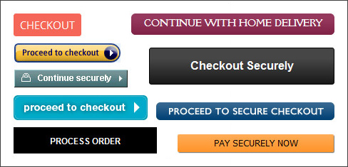
Using iconsIcons added to a button can enhance the customers understanding of what will happen when they click on it. If you use an icon next to your ‘View Basket’ link in the header of the site, add the same icon to the ‘Add to Basket’ button. An arrow on the Checkout button can show the customer that they are proceeding forward to the next stage.
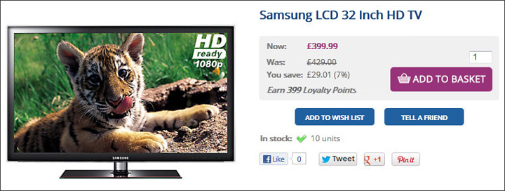
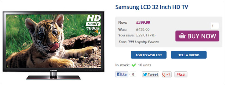
Sizing priorities of multiple buttonsYour ‘Add to Basket’ button is the most important link on your product page so make sure it is visible with a quick glance. Customers don’t want to spend time looking around for the button and if it is not obvious it is likely they will navigate away from the page. Make it more prominent by increasing its size but don’t overdo it as it can overpower the rest of the content. If you have more than one Call to Action button on your page make sure they are sized in priority. Don’t make the ‘Continue Shopping’ button bigger than the ‘Add to Basket’ button as people are more likely to click on ‘Continue Shopping’ and leave the page and not purchase.
Using the appropriate wordingThe wording of your buttons can have a big impact on whether or not the customer proceeds to the next step. Don’t let there be any doubt as to what the customer will achieve by clicking on a button. Make it absolutely clear with simple and straight forward language. The language will largely depend on your market and customer profile; what might work for a young demographic might not necessarily work for an older one. Don’t forget about the font styling either. The colour, size, font type and if it is in lower case or upper case can make a difference too. The text should be large and bold and should always be in a contrast colour to the button so that it is easy to read. Which one would make you proceed further than the shopping basket?
Create urgencyYou want your customers to proceed to the next step with as little thought as possible. If they take too long to make a decision, it is likely it will be ‘no thanks’ and will click off your site. Try to create an impression of needing to act quickly with your wording. Although this will not be appropriate for every site, or on all call-to-action buttons, it can create different conversion results during an end of season sale or if you sell products with limited stock.
Placing and spacingThe placement of your button is important too. The customer shouldn’t have to hunt for the button so make it easy for the customer to see it without having to scroll down the page. A common place to put the Add to Basket button is next to or below the product price as this allows the customer to make a quick, informed decision. If your product has options you may want to test whether the button works best above or below the options. Putting it below may allow them to spend too much time considering their purchase and putting it above may mean that they don’t choose the options they want. You also don’t want your less important buttons to be in a more prominent position than your most important button, so, make sure you consider the positioning of multiple buttons on a page. Make sure your button has room to breathe. If you clutter the content around the button it will not be immediately obvious, particularly if it is a small button or isn’t very bright. You can see the difference spacing and prioritising of Call to Action buttons makes on this particular product page. 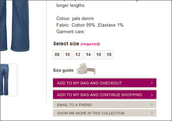 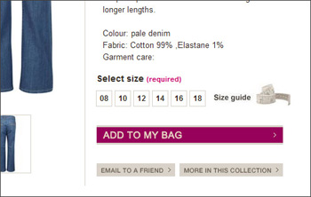 The importance of testingYou can make changes to your Call to Action buttons within the Forms tab in the Theme Editor. With any changes you make to your site, it is always best to do a controlled test to make sure they are giving you the results you expect. Choose a week where you expect a relatively normal flow of traffic through your site and change one button (changing all of them at the same time will be hard to control). Make sure you keep a record of the results the week before the change and the week during the change. You can then use this data to analyse whether the button has had a positive or negative result. You can use Google Analytics to track your changes by using their Goals feature. This allows you to set an end goal on individual actions a customer might take. A simple goal would be 'when a customer navigates onto a product page then the end goal is that they click the add to basket button'. Use Google's help guide on how to set up Goals. When you are finally happy that your first button change has been a success, start on the next one. It may seem like a long-winded process but it is better to make small changes gradually rather than major changes all at the same time. This way you are less likely to cause a negative impact to your turnover. Try Bluepark for FREE for 14 daysFull access to everything including our support team, no card details required |
|


× Create your free trialGet started for FREE for 14 daysWe recommend building your online shop on a desktop device for the best possible experienceAlready have a free trial? Sign In Now |
|